The analysis condenses your entries into trends and correlations. Goal: show you what regularly influences your mood. None of this replaces a clinical assessment. It makes patterns visible.
Time filter
At the top you'll see pills for 7 days, 30 days, 90 days and All. The default is always All. That way you see the full picture first, not a coincidentally empty week. When you change the filter, all analyses below animate live.
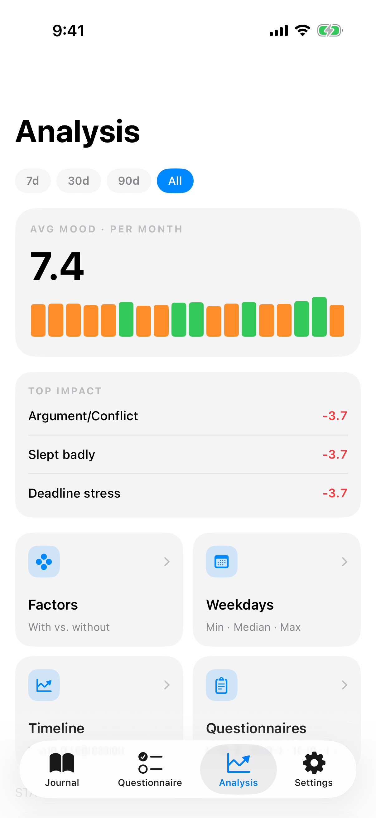
The hub at a glance
The hub is the entry page of the Analysis tab. It bundles four areas:
- Mood ring with trend: animated circular ring with your mood average over the period, color-coded from red through yellow to green. Next to it, a trend arrow and delta compared to the previous, same-length period.
- Sparkline and weekly pulse: compact trend line and a week snapshot with mood, factors and tracking dots per day.
- Four detail tiles: factors, weekdays, trend, questionnaires. Each leads to a sub view.
- Statistics and year in pixels: regularity ring, min/average/max and a year heatmap.
Mood ring
The ring shows your average for the current time filter. The color follows the score: red for 1 to 3, orange for 4 to 5, yellow for 6 to 7, green for 8 to 10. With few entries, the ring stays thin to hint that the data basis is sparse.
Trend
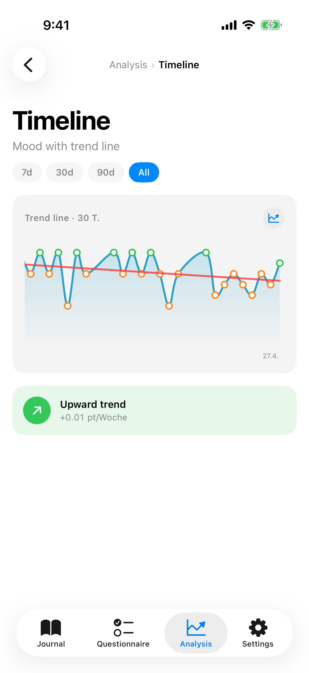
The trend detail view shows your mood progression as a line and lays a regression line over it. You pick between 7-day, 14-day and 30-day windows:
- Short window (7 days): reacts fast, shows recent turning points.
- Medium window (14 days): a good compromise.
- Long window (30 days): shows long-term tendency, smooths short-term fluctuations.
At the top you see a slope banner, e.g. "Upward trend plus 0.42 points per week" (green) or "Downward trend" (red) or "Stable" (gray). That lets you spot long-term tendencies even when daily volatility is high.
Factor impact
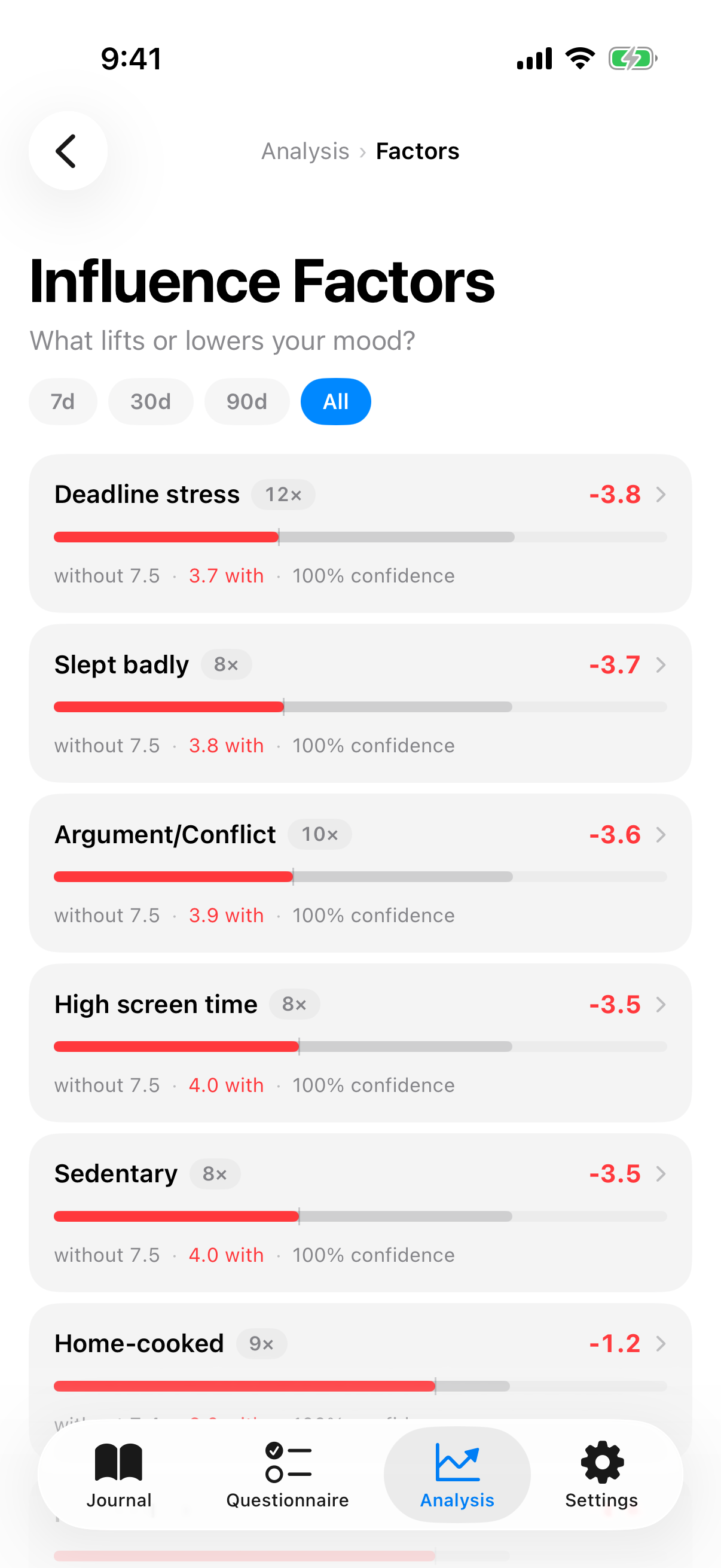
The factor detail view shows per factor a horizontal capsule with two bars:
- Gray bar = average mood on days without the factor.
- Colored bar = average mood on days with the factor. Green for positive, red for negative effect.
The difference is the impact. Next to it is the confidence in percent. If a factor occurs too rarely or the comparison group is too small, the app dims the tile and writes "Not enough data for a conclusion".
Base factors vs. impact factors
InnerPulse distinguishes two kinds:
- Base factors are things that appear in at least 60 percent of your entries. They are your normal background. Low variance, small visible influence. They are shown separately.
- Impact factors are things that happen less often but then act clearly. Therapy, conflict, a long run on the weekend.
A factor that appears only ten times but then always makes a big difference is more important than one that happens daily and changes barely anything. More details on factor logic are in the chapter Factors.
Confidence
Confidence measures how statistically solid an influence is. Not how often it occurs. The app takes sample size, effect size and variance into account via a Welch-t-Test with variance shrinkage. A high confidence value means: the difference is unlikely to be random.
Three quantities feed in
- Effect size: how big is the difference between days with and without the factor?
- Sample size: how many occurrences per group?
- Variance: how tight or wide are the mood values around their respective means?
A worked example
Imagine you have 30 entries. On 8 of those days you set did sports as a factor. On the remaining 22 days you didn't.
- Sports days: 8 entries, mean 7.4, standard deviation 2.2 (values between 5 and 9 with some ups and downs).
- Non-sports days: 22 entries, mean 5.8, standard deviation 2.7 (values between 3 and 9, larger fluctuation).
- Difference of means: 1.6 points.
The app plugs these values into the Welch-t-Test formula. The formula is:
t = (M1 - M2) / square root of (s1² / n1 + s2² / n2)
Plugging in:
- s1² / n1 = 2.2² / 8 = 4.84 / 8 = 0.605
- s2² / n2 = 2.7² / 22 = 7.29 / 22 = 0.331
- Sum: 0.605 + 0.331 = 0.936
- Square root: 0.968 (this is the standard error of the difference)
- t = 1.6 / 0.968 = 1.65
Alongside, the Welch test computes the effective degrees of freedom via the Welch-Satterthwaite approximation. For our example, about 15 degrees of freedom come out.
In a standard t-distribution with 15 degrees of freedom, a t-value of 1.65 corresponds to a two-sided p-value of around 0.12. The app computes confidence as 1 minus p, so roughly 88 percent.
It shows you "Confidence 88 percent" with a green indicator. Translated: in about 12 of 100 samples this effect would arise by chance, in 88 cases the connection is real.
If the same difference were based on only two sports days, the standard error would grow so much that the t-value would fall below 1. Confidence would drop to around 40 percent. Too little to trust. The app then dims the tile and writes "Not enough data for a conclusion".
Variance shrinkage additionally pulls very small or very large variances toward a mean, so outlier samples don't overdrive the result.
With three to five observations per factor, confidence is still low. From ten observations and a clear effect onward, it climbs fast. If confidence stays low despite frequent occurrence, the effect is probably small or fluctuates a lot.
Interactions
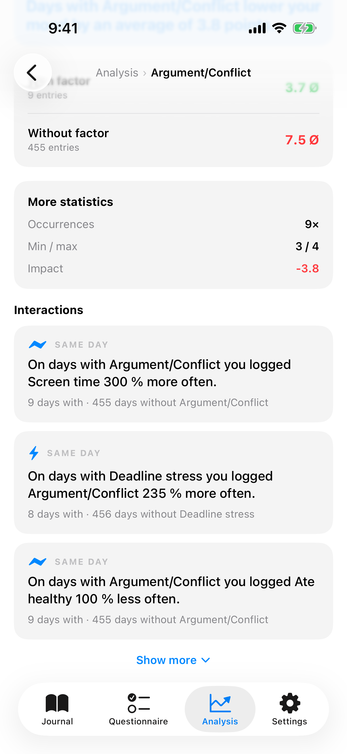
Since version 4, InnerPulse recognizes not only how a single factor affects your mood, but also how factors relate to each other. When you tap a factor in the analysis, the app shows you its strongest interactions as full sentences. There are two kinds:
- On the same day: factors you often set together, or specifically not together. For example "On days with Exercised you logged Ate healthy 40 % more often" or "On days with Deadline stress you logged Exercised 30 % less often".
- On the next day (time lag): effects that only show up one or two days later. For example "After days with Little sleep your mood is 0.8 points lower the next day", "The day after Argument/Conflict you log Slept badly 25 % more often" or, with a two-day lag, "Two days after intense exercise, your mood is 0.5 points higher".
Below each sentence it says how many days or day pairs it is based on, so you can gauge how meaningful it is. By default you see the three strongest interactions; with Show more you expand the rest.
All of these sentences are expressly observations, not diagnoses and not statements about cause and effect. They show patterns in your own data. What they mean is up to you to decide, sometimes together with your therapist.
Intensity impact
If you use the intensity slider for a factor (see Mood Journal and Factors), the app can look even more closely. Instead of just "with" and "without", it then compares high and low intensity of the same factor.
The result appears in the factor detail view as its own sentence, for example "On days with high intensity of Exercised your mood is 1.2 points higher" or "On days with high intensity of stress your mood is 1.6 points lower". Behind it, it says how many days fell into the high and into the lower group.
That way you recognize not just whether a factor has an effect, but also whether the dose makes a difference. Even one consistently tracked week can give first hints.
Weekday pattern
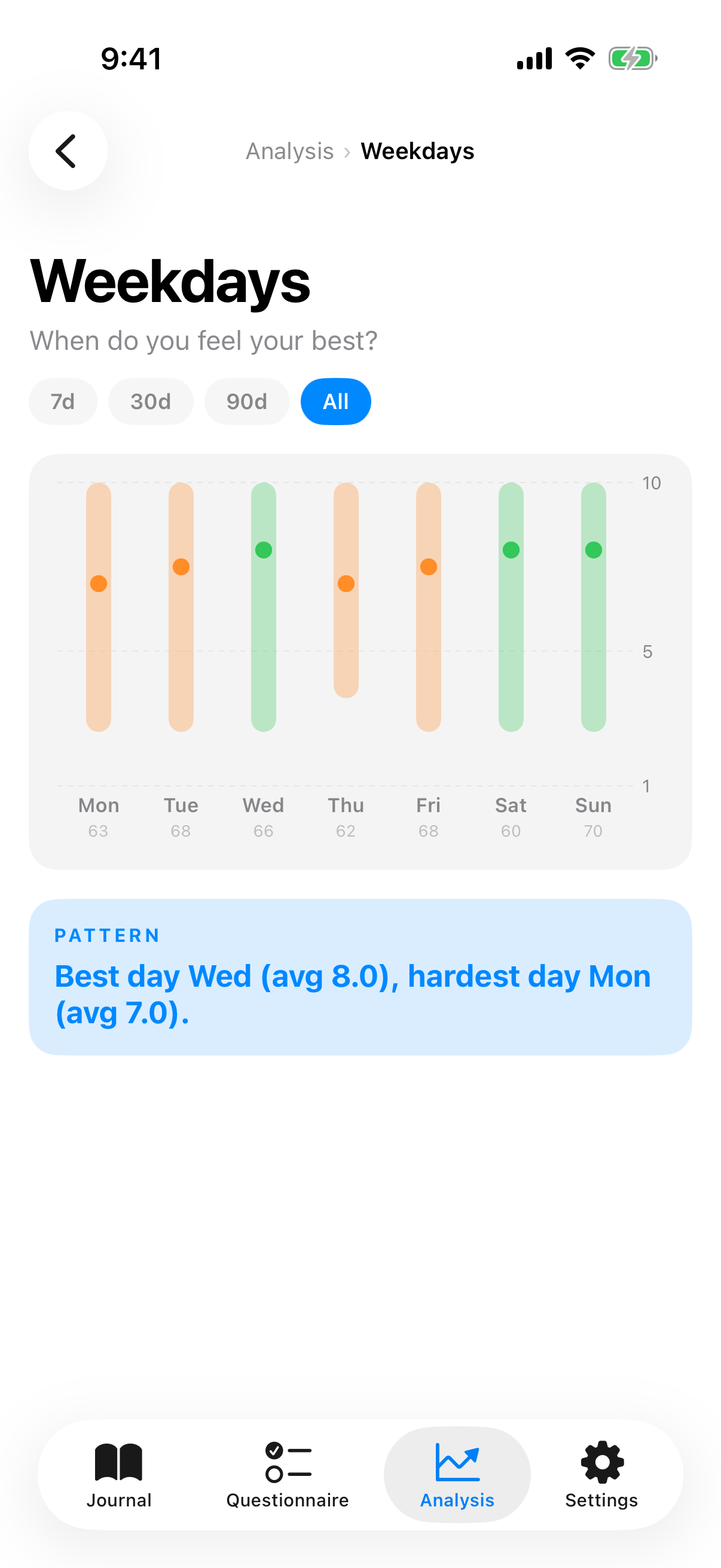
The weekday analysis shows for each day of the week a gray band from min to max and a dot for the median. Below it the count of entries on that weekday. An insight card at the end summarizes, e.g. "Best on Thursday (average 7.2), toughest day Monday (average 5.1)".
Useful for planning self-care. If Mondays are hard, deliberately don't put important appointments there.
Questionnaire history
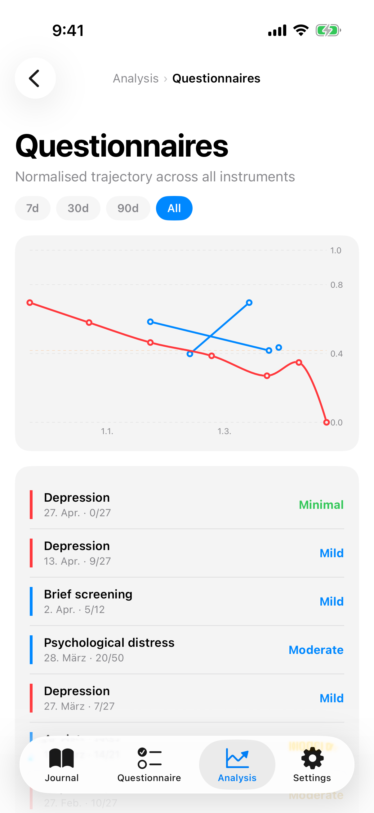
Here you see PHQ-9, GAD-7, K10 and PHQ-4 in one chart. To make the tests comparable, scores are normalized to a common scale from 0 (no distress) to 1 (maximum distress). Each test gets its own color: PHQ-9 blue, GAD-7 orange, K10 teal, PHQ-4 indigo.
Behind the curves lie severity ribbons as color-graded bands. So you see at a glance which severity zone you're in, without needing to know the exact number.
Year in pixels
The last tile opens a heatmap of the year. Each day gets its own rectangle. Color equals average: gray for days without an entry, red through yellow to green for the mood range.
Useful for seeing at a glance when tracking gaps were and when good or hard phases happened. Especially striking when you want to show a therapist or doctor what happened over the year. A tap on a day opens the corresponding entry.
Regularity
The regularity ring shows on how many days of the selected range you tracked. With "All" as filter, the ring counts from your first entry. There are no streaks, no badges, no push reminders telling you that you missed something. The ring is information, not pressure.
What to know
- Analyses are recalculated every time you open them. There is no cache that becomes stale.
- At least three entries are needed for meaningful trends. With fewer, the app shows empty or subtly dimmed tiles.
- Correlation is not causation. The app shows connections. Interpretation is up to you, sometimes together with your therapist.
- Interactions and intensity impact are found by tapping a single factor in the analysis. They appear there as sentences below the with-without comparison.
- If you want to export analyses, e.g. as a PDF for the next appointment, see Export your data.
- Anyone who wants to understand questionnaire results better combines this chapter with Check-in Questionnaires.